Saturday, 18 May 2013

Moving!!

  
Hi folks. Glad its the weekend, aren't you? Well I'm still super busy and now I'm moving my craft room from a downstairs room to a spare bedroom upstairs. I have basically outgrown the downstairs space and need a little more room. I'm ashamed to say I can't even get near my desk at the moment as that pile of "to do's" and stuff to put away has just got bigger and bigger and now it's toppled over and I don't have the energy to address it knowing I've no where to put most of it! Anyway everything I'm making at the moment is half finished. Do you do that? Or is it just me? I never do one thing at a time which is sometimes my downfall! Anyway I thought I'd show you a card I made a while ago as at least that's finished and that's what you want to see right? This was actually an Anniversary card I made for someone but I guess given the purpley red colour it would make a nice Valentines card too.

 
 The beautiful flourish in the corner is not my from usual go to Spellbinders dies but I saw it at a Craft show and just loved it and had to have it. It is actually a Cheery Lynn die called Victorian Romance Flourish. The one thing for me that's sets Spellbinders apart from other dies is the embossed detail and whilst this is still a pretty die it doesn't have that embossing which leaves the die cut a little flat and one dimensional. I am slowly succumbing to other die manufacturers but Spellbinders will always be number one in my opinion.
 Speaking of which I used Spellbinders Lace Doily Motifs and cut two of the largest die in the set in order to make two square shapes into the rectangle shape I needed. I also used Labels Twenty Nine and you can just about see it behind the sentiment which was taken from a Simple Stories paper collection. It's unusual for me to do this as I like to stamp my sentiments but it was such a lovely sentiment and they just don't make stamps that say everything you need and if they did it would cost a small fortune and the storage...well I wont go there eh!
The patterned and the cream card used was Kanban. The red coloured card was Co ordinations. The cream card was embossed with Couture Creations Tied Together folder. The red border with the hearts cut out was from the Spellbinders Edges and Inserts dies. I can't tell you what they're called as I just put all the sets on two A4 magnetic sheets and didn't write the names on! The hearts, which technically are the waste, were used to embellish the flourish and to even up the card on the eye I placed the other two in the top corner. The card was finished with some thick ribbon from my stash and a Prima pearl flourish. Unfortunately I didn't write down what I used to make this card. I always do now and recommend you keep a record of items, dies, paper etc that you use on each project so you can look back and find something easier. Don't do what I'm doing now and try to recall from memory, it will drive you nuts!! The centre piece on the ribbon were pieces cut with Spellbinders and when I come across them I'll let you know what they are but for the life of me I just can't remember! Call yourself a Spellbinders fan!!! The centre piece is a button from Webster's Pages.
As always the box to house the card. Two sheets of A4 Kanban cardstock. The tendrills are left overs from the Cheery Lynn flourish. The mystery die again! Also Spellbinders Spiral Blossom One. The stamp used is from Clarity Stamps.
Have a great weekend whatever you are doing. Back soon
Michelle x.

Wednesday, 15 May 2013

Busy Busy Busy!

Hi to all.
Sorry for my absence but have had a lot on my plate these past few days and I have had to step up the training a notch as I have sold some serious raffle tickets for my Fathers Day card and so don't want to let anyone down. Plus my husband and kids and a whole bunch of peeps are coming to watch my "performance" so I want to do it without looking like I am going to keel over!! Anyway wanted to show you a card that I made to thank all the lovely gents that are clients of The Gentry Didsbury that have been buying the raffle tickets. The card will be on display at the salon tomorrow for anyone to read.

 
There was an awful lot of die cutting involved with this one. I started with my trusty Kanban card stock in white and used an A4 Spellbinders embossing folder called Dainty Dots to emboss the entire card base. I then used some Navy coloured card along with a patterned piece called Jubilee Damask and used A2 Curved Borders One (Spellbinders) to edge my matting layers.
I then used two different Spellbinders sets from two Becca Feeken papercraft kits to cut the fancy square and circle and the fancy corner piece. I then used a set of Waltzing Mouse stamps called My Kind Of Guy. This was the set I also used to make the Fathers Day card and I just can't stop using them as they are so different to much of whats out there in terms of stylish sentiments for men. The word "Gentlemen" actually says "Gentleman" on the stamp set so I stamped the word twice and cut out the "e" from the extra stamped word and swaped the "e" for the "a" and mounted the pieced together word on some navy card. I then used a small die from Spellbinders A2 Fancy Postage Edge to stick the mounted word onto and finished it with two navy rhinestones from Kaisercraft. Before sticking the die cut pieces down I threaded through some ribbon from Creative Expressions, which is navy on one side and silvery white on the other. The amazing thing about this ribbon is that when its lay flat it keeps its solid colour but whenyou tie abow with it you get
both colours as the light falls on it. It's absolutely lovely. If you look closely the ribbon looks navy on the left but the bow is a mix of both colours. Very clever, don't know how they do that but I hope they make it in other colour options.
The inside panels were cut using the same dies as on the front. The central stamped die cut and the panel I have written on were made using Spellbinders Radiant Rectangles. The Thank You stamp was from a Waltzing Mouse Stamps set called Big Day Essentials. The font is beautiful. I have a Wedding Invitation set using theses stamps to show you soon.
I finished the card , as I always do, with my bespoke personalised stamp from Clarity Stamps.
I hope the guys at the Gentry like it and I hope you do too. Back soon.
Michelle x.

Saturday, 11 May 2013

Welcome Baby

Hi and happy weekend. Hope the weather is better where you are that it has been in Manchester today! I have two cards to show you today as I couldn't make one without the other!
 
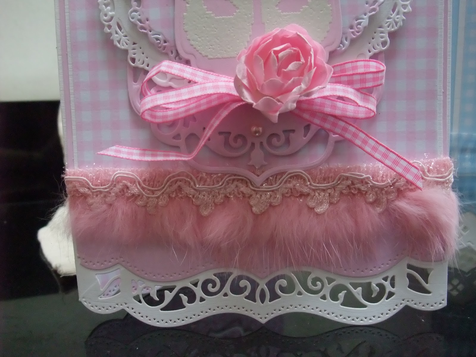
These cards were easy to put together. It was just a case of matting lots of layers. I started with the Gingham card in baby pink and blue which had a matching solid colour piece to go with it from Kanban. I took some linen textured Kanban card in white for the base card, scored it at A4 fold on the Ultimate Pro (Crafter's Companion) and then took two different Spellbinders A2 Bracket Borders One dies in two different combos to create a nice shape for the bottom of each card. I also cut the same shaped edge into the inside and back of the card and added a piece of the Gingham card to the inside with the same cut edge so that from the front you could see through to the Gingham card. I cut the same edge into the solid coloured pink and blue card as this was the first mat and it sits nicely and matches the base card edge. I then matted a Gingham layer onto a white layer and secured the trim on the pink card and the ribbon on the blue card before sticking it all down onto the white base card. The Trim was from Webster'sPages and the ribbon was from my stash. The little pink Gigham ribbon was from an Embellishments kit from Angel Crafts. The paper rose was from Magnolia and the button that I added two tiny Prima pearls to was again from my stash.


The Spellbinders used on the pink card to make the central focal point were the 5x7 Elegant Labels Four followed by the two biggest dies from Imperial Gold Labels Four. I cut and embossed these using the recommended Junior Magnetic Placement Mat and I can tell you that I had used the dies a couple of times before and they were no where near as deeply debossed without it. Even the cut was far better. I then added a final mat of Labels Four and turned it the opposite way. I stamped both cards with the same cute sentiment and baby shoes from Waltzing Mouse Stamps. I finished the card with a few Prima pearls.


The Spellbinders used on the blue card were the largest die from Decorative Labels One, then a Scalloped Labels One, then the next biggest from the Decorative dies again followed by the second largest die from Labels One Small. Again I finished off with a couple of Prima pearls.
 
 
Hope you like them. Back soon.
Michelle. x.

Thursday, 9 May 2013

Just A Quickie!

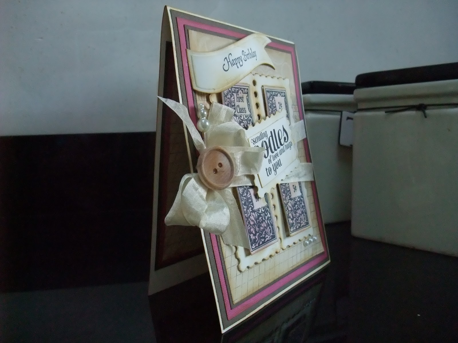
Hi there. Wanted to show you a card I made using something a little different as all the items came from a crafting kit, not something I usually do but the lady who designed the kit is the one and only Becca Feeken (of Amazing Paper Grace). If you haven't heard of her check out her blog 'Amazing Paper Grace'. Everything she does is stunning and always pretty, which I love. If you can have a crafting idol she is mine!
All the card, paper and embellishments were in the kit. The patterened paper was from 7Gypsies. The great thing about the kits she produced was that you got a set of Spellbinders dies, exclusive to Becca and her kits, along with an exclusive set of stamps from Justrite. The beautiful William Morris style patterned squares was one of the stamps and the huge 4 windowed postage frame was one of the dies. The kits came with instructions to make several items and this card was one of them. The only things I altered was the addition of a Spellbinders Banner with Happy Birthday and I also used a sentiment stamp from Waltzing Mouse, another must of mine, instead of the sentiments stamps supplied and added the extra postage die cut to take the sentiment. I also changed the interior of the card to suit the person I'm sending it to.
Sadly Becca has stopped making the kits due to other commitments. You may have seen or even own the Filigree Delights die set she designed for the latest release of Spellbinders and she has some new stamps released this month for Justrite.


 I don't know if the photo shows it well but the colours were quite masculine and I am in fact sending this to a male, although if I had made it the way the kit instructions show it would have had a pearl flourish and a flower where my button is which made it look far more feminine. Hope you like it and check out Amazing Paper Grace if you haven't already. She can't fail to inspire you. Back soon
Michelle x.
Tuesday, 7 May 2013

Finally!

Finally! Never thought I'd get here as everything that can get in the way did get in the way but the piece I've been messing (my Husband's word) with over the weekend is done, even though it doesn't have a home yet.
It's a lovely Cuckoo clock kit from Kaisercraft that I have decorated with French Country papers from Graphic 45. It has taken so long because I had to sand the MDF parts down. Then I painted the parts using Kaisercolour paint. I mixed Pistachio and Soft Moss to get the colour I wanted. When that had dried  I painted on a coat of Distress Crackle paint from Ranger and when that took effect I rubbed over with Black Soot Distress ink to give an overall worn and aged look.


Next I set about drawing around, in pencil so I could rub away any unwanted lines later, the various parts. I then cut them all out and went around all the edges with the Black Soot Distress ink. I then stuck them all to their matching MDF pieces and coated each one with a layer of Matt Multi-Medium from Claudine Hellmuth Studio. I then started to cut out elements, such as the rooster, that I wanted to use to decorate as well as using the Spellbinders Jewelled Flowers and Flourishes and Bitty Blossoms.


The flowers were shaped using an embossing tool and mat and were finished with black sparkly centres from Creative Expressions. The roses were rolled with a quilling tool. All the bits and pieces and flowers were then coated with Matt Multi-Medium. I then used Spellbinders Grand Decorative Circles One to make the centre piece for the clock face and added a circle from patterned paper and som Kaisercraft pearls in pewter to represent the numbers on a clock face.
I then used some Tim Holtz chain and brads to attach the pendulum pieces to the clock and then covered this over with a scalloped MDF trim. I also used the Heartfelt Creations Decorative Chateau Gate for the little window and added two French Country stickers and a chicken I cut out to the inside, mounted from behind the clock. I added a couple of pewter pearls for handles.


 It was then just a case of glueing all the bits where I wanted them and giving everything a further coat of Multi-Medium. I added the clock workings and FINALLY it was done.
 
Well I said come hell or high water I was posting this today and believe me this post has took an age as my server wouldn't download the pictures and now its jumbled them all up so I apolgise if the photo's don't flow as they should. I was just grateful to finally download them. Hope you like it. Back soon
Michelle x.

Monday, 6 May 2013

Not quite what I wanted to show you!

Hi and happy bank holiday Mayday Monday. Hope you have been enjoying the fabulous weather and long may it continue although I have to say that running in that heat was not much fun and I ran early before it really got going!!
I have been working on an altered item all weekend, apart from much of today because my husband drove me around four, yes you heard me right, four different B & Q's for a particular range of garden table and chairs. Isn't it funny how we all scramble for these things when the sun decides to make an, no doubt brief, apperance! Yes, we got said chairs and table (and we would have got them a lot quicker if he had just listened to me and gone to the B & Q I suggested in the first place cos yes that's where we were successful!!!) but sadly my project isn't quite ready to show you and I blame my Hubby wholeheartedly but I will post it tomorrow whatever happens. Anyway here is a sneaky peak to keep you guessing!
 
I have pretty much taken step by step photo's in case anyone out there needs a little inspiration starting something similar.  As you can see the Spellbinders Jewel Flowers and Flourishes were involved along with the most beautiful papers from Graphic 45 called French Country. If you haven't come across these yet check out the Graphic 45 website (just type in name in search engine) their stuff is amazing and exceptional quality as their paper is really cardstock and holds up to lots of bending and shaping without damaging it and the pattern's and themes are just so different from the rest...my absolute favourite!
Anyway enjoy your bank holiday evening and I will be back tomorrow
Michelle x.

Friday, 3 May 2013

Something Useful!

Hi, Friday again. Do you feel like life is going to fast. This week has sailed by.
Firstly I just want to say a big thank you to all of The Gentry clients who bought a raffle ticket to win the Fathers Day card I made. We decided to raffle the card rather than auction it and it is only day one and many peeps have bought a ticket already so just in case any of them ever see this a REALLY big THANK YOU!
As I am still busy with new things I wanted to show you something different and something I'd never done before. These were mobiles, in fact I made three practically identical ones, for a mother and baby unit. They are all black and white as this is what newborns see and are stimulated by.


The dotty paper was from Daisy Bucket. I'ts not a company I see advertised anymore so maybe they no longer exist. I'd had the paper a long time! Everything else was made simply with black and white cardstock. The birds on the bird house were cut with an older Spellbinders die called Bird Flourishes. The circles, the stars and the butterflies were also Spellbinders dies. Everything else was cut from various cartridges on my Cricut. I attached all the elements with Papermania brads and twine. On the end of each element is a black and white bead to weight it down so it hangs straight. I attached all the pieces from the bottom of the bird house and then glued for extra hold inside before adding a roof with some polka dot ribbon already threaded through so the mobiles could be pinned to the ceiling above the babies cots.
 

 It was really just a case of alternating black and white across the elements. The patterns on the bird and the large swirls were done with a black Pro Marker. It was good to make something useful. Hope you like them. Back with something newly made over the weekend. Have a good one!
Michelle x.